Dashboard
Peripherals Status
This section shows the state of the peripherals (Sensors, digital I/Os, watchdogs) in a customizable table format. The information shown gets updated in real time, to give an up to date overview of the system state.
Status and Event Table controller

To customize the table display, the controller bar features multiple features, which are all optional.
Choose which type of peripherals should be included in the table.
Only show rows, that represent a peripheral that is not in normal state.
If groups are defined, select one of the existing groups from the dropdown, to only show peripherals belonging to that group.
Choose the attribute to sort the rows by from the drop down. The order (ascending/descending) can also be set.
To reset the filter and sorting settings to factory default, click on the reset button.
These settings will be saved in your browser.
In case of a problem, please refer to Troubleshooting.
Status and Event Table

Each row represents a peripheral device.
Refer to the table below, for an overview of the Status and Event Table heading and cell meanings.
If a peripheral is not within it's normal range (abnormal condition), the row gets righlighted in orange.
| Peripheral Type | Name | Value | Condition or Output Control | Activity | Group |
|---|---|---|---|---|---|
| Sensor | Name of the Peripheral | Current sensor reading,--- in case of a failure | Abnormal condition e.g. Too high,or empty, if within normal range or error code | Time since the last change in state or value since page load | The group this peripheral belongs to |
| Digital Input | On or Off | empty | |||
| Digital Output | On or Off | A toggle button to control the output | |||
| Watchdog | empty | Last check result, or Deactivated |
Sensor errors
In case of a problem with a sensor, an error code might be displayed in the Condition or Output Control column. See Troubleshooting.
Peripherals History
This section shows the historical data of the peripherals (Sensors, digital I/Os, watchdogs) in the form of highly customizable diagrams.
You can add (and remove) chart instances, each of which can display the data for one or more peripherals.
By default, one chart instance is already setup.
Like with the Status and Event Table, the historical data can get updated in real time.
Historical Data Controller

The settings of the controller are applied to all chart instances, if more than one is configured.
The data controller acts as a means to set the desired timeframe of historical data to show.
Click, to add a new chart instance, which will be appended below the existing chart instance(s). See Configuration and data selection for details on how to setup the new instance.
Choose a start and end date for the timespan you would like the chart(s) to display.
Choose from the provided periods.
On the left of this picker, the currently effective Time Step is displayed.
The Date Picker and Period Picker can not be used at the same time. Setting one disables the other.
When the site reloads, the 3h period from the period selector is active.
Historical Data Charts

A chart widget consists of a top bar, with buttons for Data Selection
depending on the settings made in the data selection panel.
General
A single chart instance can display multiple data sources (continious or discrete).
While those data sources each render a time series representation (line chart or discrete event chart), they share certain elements.
Time axis & Time Steps
The time axis spans the selected time interval of interest, that was selected via the Historical Data Controller, either by the Date, or the Period Picker.
Depending on the selected time interval and the browser window width, the time axis is divided into equal time steps.
The currently effective time step is displayed on the left side of the Period Picker in the Historical Data Controller.
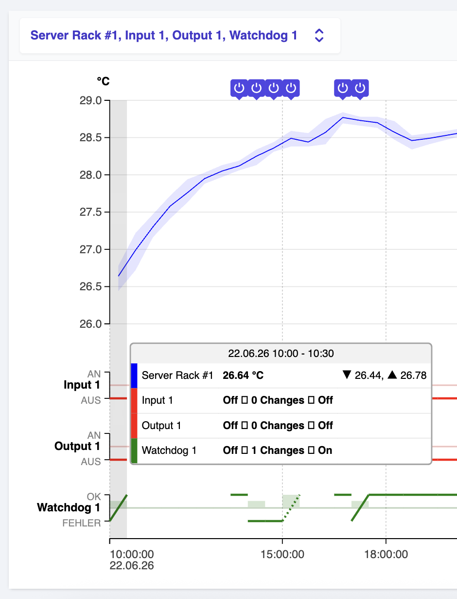
Tooltip
A tooltip, that gets displayed when the chart is hovered with the mouse.
Depending on the horizontal cursor position,
the head of the tooltip shows the selected (hovered) time step, while underneath it displays a row with detailed information for each data source at the selected time step:
- For continious data sources (sensors) the average value is displayed on the left, while miinimum and maximum values are displayed on the right.
- For discrete data sources it shows
State at the beginning of the time stepNumber of changes within the time stepState at the end of the time step.
Reset markers
Reset markers on the top of the chart, that indicate a system reboot
Line charts
Line charts display the time series of continious sensor values.
Lines are rendered in the color, that was selected in the data selection panel for the corresponding sensor.
- The main line (bold color) represents the average sensor value of the time step.
- The area underneath (light color) is spanned by the minimum and maximum values that occured within the time step.
If multiple continious data sources (sensors) within the same chart instance are configured to use the same unit, they share a common y-Axis. If they use different units, each gets its dedicated y-Axis.
Discrete Event Charts
Discrete Event Charts display the time series of discrete events (or state changes), like Digital Input or Output, as well as Watchdog state changes.
Each discrete data source renders its own event chart, along with a y-Axis with labels for the corresponding states (On and Off for Digital I/Os, OK and Failure for Watchdog states).
- The main line (bold color) represents the state of the peripheral throughout time steps.
Within a single time step
- Horizontal lines indicate that the state at the beginning and the end of the step were identical.
- Diagonal lines indicate that the state at the beginning and the end of the step differ.
In both cases, it is possible, that the state changed during or in the middle of the time step, while the start and end states are still identical.
In this case, the line gets drawn dashed.
If state changes occured during a time step, a rectangle (light color) underneath the main line represents the number of state changes in a bar chart manner.
Configuration and data selection
Click on the button on the top right of a chart widget
Here you can choose, which peripherals to include in the chart.
The panel is composed of rows, where each row corresponds to a peripheral.
To include the historical data of a peripheral in the chart, tick the checkmark in the corresponding row. On the right side of the row you will find a color picker, that you can optionally use to define a custom color for the data row to use in the line chart or event chart.
On the bottom of the panel, there is a Groups section. If you have defined groups (see Peripherals), choosing a group from the drop down menu will select all peripherals belonging to that group automatically.
Chart Menu
Click on the button on the top right of a chart widget
Here you can
- Enable the Fullscreen mode, to enlarge the chart
- Move up or Move Down the chart, relative to other charts
- Remove the chart instance
Troubleshooting
General
If you encounter a state, where the display of information on the dashboard is corrupted, you can reset the dashboard configuration on the General configuration page by clicking under Maintenance, as described here.
Problems with sensor readings
In case of a problem with a sensor, an error code might be displayed in the Condition or Output Control column.
A list of common error codes and their meanings can be found on the sensors docs page.